Installation
# Install from GitHub
pak::pak("dusty-turner/ggfunction")
Your first plot
Pass any function and a domain:
ggplot() +
  geom_function_1d_1d(fun = sin, xlim = c(0, 2 * pi))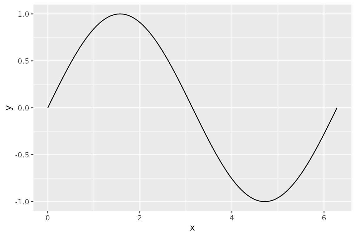
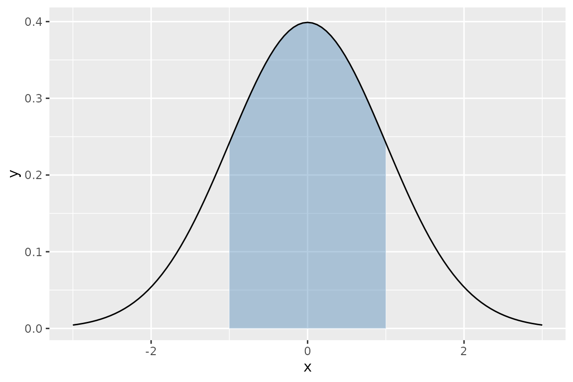
Shading a region
Use shade_from and shade_to to highlight an
interval under the curve:
ggplot() +
  geom_function_1d_1d(
    fun = dnorm, xlim = c(-3, 3),
    shade_from = -1, shade_to = 1, fill = "steelblue"
  )
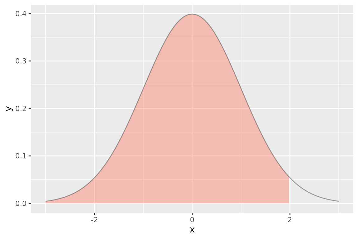
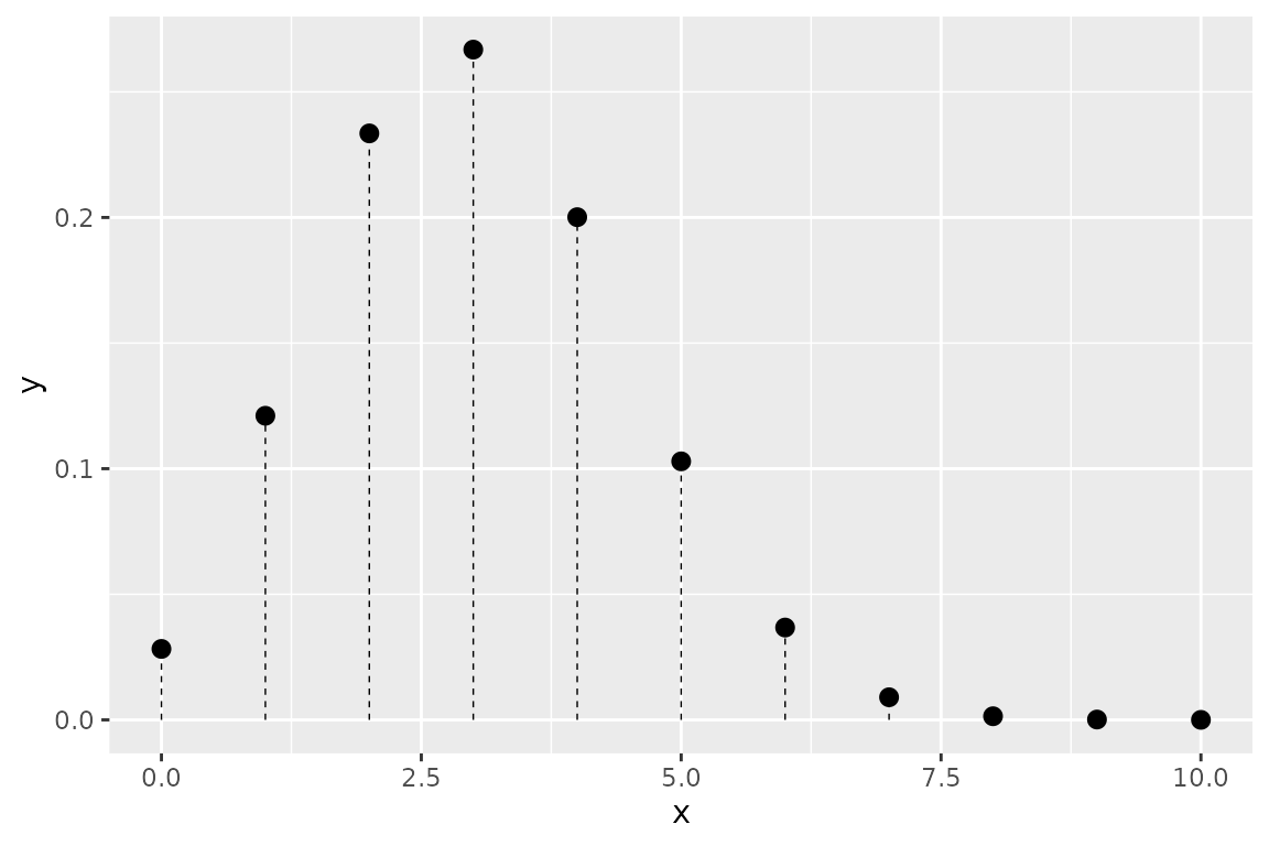
Plotting a distribution
geom_pdf() is purpose-built for density functions. Use
p to shade a cumulative probability region:
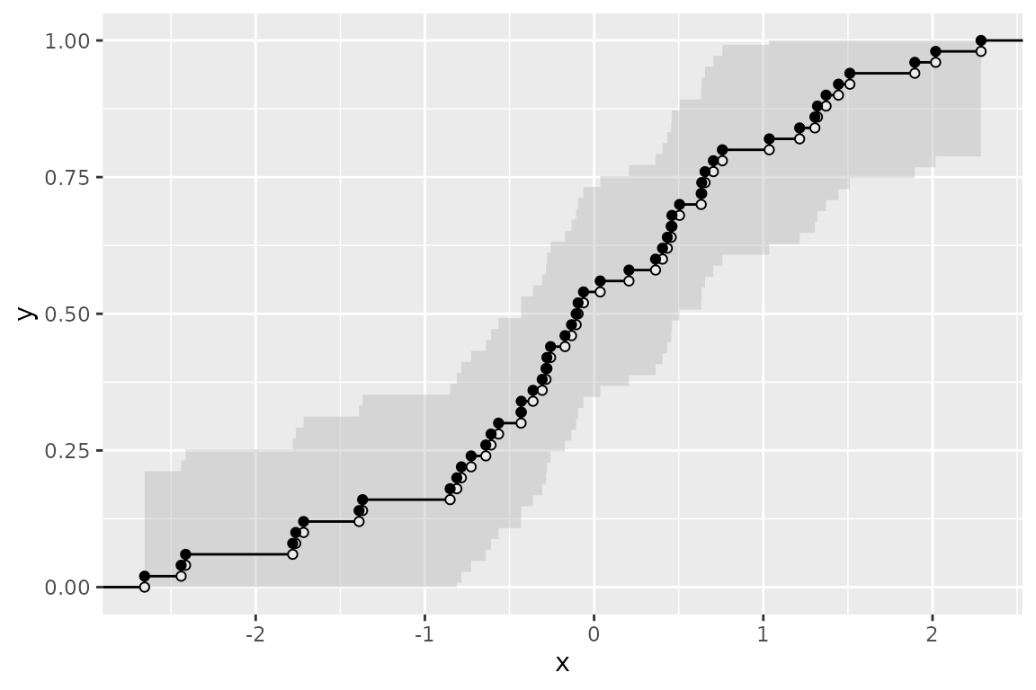
Working with data
geom_ecdf() builds an empirical CDF from observed data,
with an automatic Kolmogorov–Smirnov confidence band:
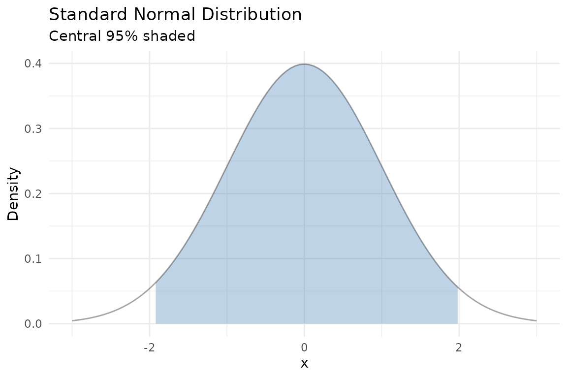
Layering with ggplot2
Every ggfunction geom is a standard ggplot2 layer. Add
themes, titles, and other geoms as usual:
ggplot() +
  geom_pdf(fun = dnorm, xlim = c(-3, 3),
           p_lower = 0.025, p_upper = 0.975,
           fill = "steelblue") +
  labs(
    title = "Standard Normal Distribution",
    subtitle = "Central 95% shaded",
    x = "x", y = "Density"
  ) +
  theme_minimal()